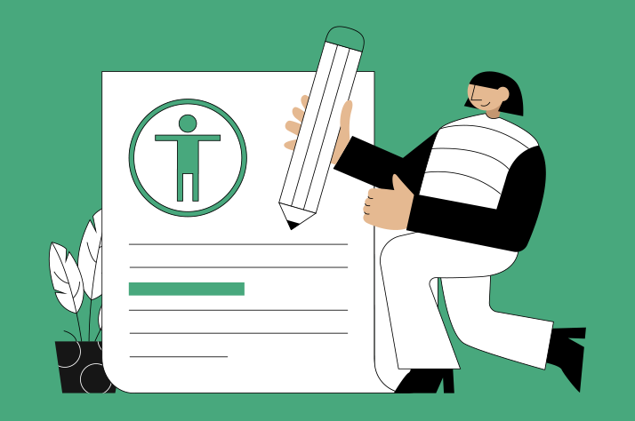
What is accessible content?
Accessible content is digital information that is designed and presented in a way that can be easily accessed, understood, and interacted with by all people, not just those with disabilities.
This involves creating content that supports various assistive technologies, such as screen readers. It also means adhering to principles that ensure content can be consumed in different forms to accommodate a wide range of abilities.
Ultimately, the goal is to remove barriers that might prevent individuals from accessing and benefiting from the content, making it inclusive to everyone.
Accessibility quick tips
Readability
When we talk about readability, we’re focusing on the quality of the written content and how it’s presented.
Accessible language is an integral part of this and can be characterised as follows:
- Short sentences - less than 14 words if possible
- Plain English - pitched at the reading level of a middle-school student
Creating a logical structure to present this written content is just as important. Some ways to achieve this include using:
- Short paragraphs of around five sentences each
- Headings (i.e. a H1, then H2s, H3s and H4s) to break up content and make it skimmable
- An information hierarchy that ensures important points stand out
- Lists to summarise longer or more complex pieces of information
Following these guidelines creates content that is easier to engage with. The content will also be more accessible to more readers, which opens up opportunities to expand your audience.
We worked with Alcohol Think Again to develop a website that exemplified these characteristics. Read the case study to learn more.Visual design
Font size and style, graphics, images, and colour all have one thing in common: they’re crucial elements of both accessibility and visual design.
Colour contrast requirements aim to create harmony between these elements. The term refers to the difference in brightness between foreground and background colours. Appropriate contrast levels are expressed as ratios, and different ratios are required in different contexts. For example, large-scale text (at least 18-point or 14-point bold) is subject to more lenient contrast requirements than smaller text. The Web Content Accessibility Guidelines (WCAG) 2.2 provide further information about these requirements.
We recently worked with the Shire of Augusta Margaret River to design a new, accessible website. In the below example, you can see how colour contrast ratios informed the use of brand colours in designing the site’s user interface (UI).
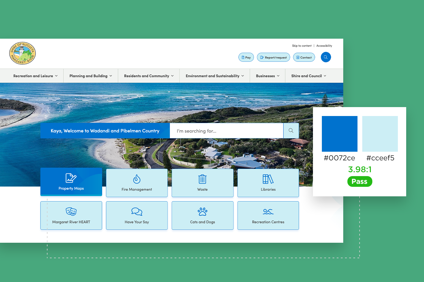
Read our case study on the Shire of Augusta Margaret River's accessible website design to learn more.
Accessibility devices
In accessible website design, accommodating accessibility devices is crucial for ensuring that all users can effectively utilise and navigate digital content.
These tools include:
- Screen readers for the visually impaired
- Adapted mice for those with motor challenges
- Voice recognition software for users with limited mobility
- Screen magnification software for people with low vision
Ensuring websites are compatible with these tools is crucial for making web content universally accessible.
One factor that contributes to this is the use of alt text. Short for 'alternative text', alt text is a description of an image that is used in HTML code to provide context for the images on a webpage. This means that people who use a screen reader will still be able to understand what the image depicts because their reader will relay this description.
Apart from making images accessible to all people, alt text also has powerful implications for SEO, helping search engines better understand the content of an image and the page on which it resides.
For our redesign of Cockburn ARC’s website, we made all UI decisions with accessibility tools at front of mind. Check out our case study to learn more.
Making your content more accessible
Creating accessible content is the right thing to do and, depending on the industry in which you operate, may also be a legislative requirement.
If you have a question about how to make your content more accessible or how to ensure you’re complying with accessibility legislation, get in contact with our team today.